Introduction to My Image Project
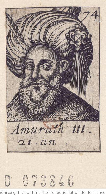
For the image project of the HIST 697, Creating Digital History, course at George Mason University, we are expected to demonstrate our ability to demonstrate competency in using photoshop to repair and colorize images as well as incorporating them into a website. I repaired and used two different techniques on two different images. The first image is a woodcut of Murad III, the sultan of the Ottoman Empire from 1574 to 1595. The image is availabe through Gallica.bnf.fr, the online repository of the Bibliothèque Nationale de France. The second image is a photo taken between 1860 and 1870 of an unidentified man, whom it would appear was prospersous and wanted it to be known. The photo places an extraordianarily long drape and an ornate chair in promoinent places in the photograph, making his consumption more than conspicuous. The image is available through the Library of Congress website.
Both images have been restored. There was more work to be done on the woodcut of the sultan than the photograph. The photo was in pretty good shape. The two differ primarily in the technique used to provide their particular looks. The woodcut has a new background and a vignette around the edges to draw greater attention to the face of Murad. The backgrounds are very close to the same color because the color of aged paper is part of the theme that I am implementing in my websites. The photo of the man is received more elaborate work. It, as is clear, is a full colorization.
The Woodcut of Murad III
Problems
As stated, there are many more problems with the original woodcut than there are with the original photogrpah. The paper on which the woodcut was printed either deterioriated, or the woodcut was poorly printed. Either way, the background of the print has numerous lines and marks throughout. Also, there are two major marks on the paper that draw the eye away from the face. The first is the "74" in the top-right corner of the woodcut, which was placed on during the printing process. The second is a red stamp that was placed on the paper after the printing process, presumably by the archive. Both of these had to be removed--one more intentionally than the other.
Process
To begin, I had to eliminate the ugly border and caption below the picture, so I cropped the image just within the border of the directly surrounding the bust of the sultan, which eliminated most of the eysore associated with the image. I then resized the image, making it bigger to account for the space lost from cropping so much out. I then wanted to eliminate the background, so I could better blend the background to my website. Using the blend options feature, I eliminated the tan backgrounding leaving only the black lines of the woodcut. I think it was during this process that the red stamp was eliminated. This also provided the best time to eliminate all of the background markings that were the byproduct of a less-than-stellar printing or the deterioration of the paper (I personally suspect a less-than-stellar printing). Nevertheless, I used the eraser tool to erase all of the background smudges and lines to provide a cleaner, crisper image. In order to create a vignette, I then applied an empty background, then a tan background on top of the blank back ground, but behind the woodcut. I then began using the eraser at a large level with a light opacity to begin deleting the edges of the image, so it might blend better into the background of the site. Then, I selected the tan-background layer, which was slightly darker than my site color. I began deleting the background color in a similar manner. I used multiple passes along the edged to delete the background all together, so the image would more easily blend into the site. I then used the sharpen filter and the auto tone tool to make the image crisper.
Photo of an Unidentified Man
Problems
The original of this photograph had very few problems. The biggest problem was the easiest to fix, the gawdy border. I simply cropped it out. Besides the border, there were a few splotches where the image had deterriorated, but they were all minor. I simply used the spot-healing-brush tool eliminate them from the photo. The process of colorizing the photograph provided a more important problem than the issues with the image. I am neither familiar with this individual nor very familiar with the period (I study sixteenth- and seventeenth-century France and Ottoman Empire, and this image is from post-bellum America). Thus, all of the colorization is pure speculation based off of assumptions.
Process
After cropping and restoring the photo, the colorizing process was much more time consuming than anything else done to either image. All of the color work was applied with a large brush with around 30% opacity and 40% flow. I wanted to add color slowly and with a light touch in order to keep the textures and color gradiants that are present in the grey scale photograph. Also, this allowed me to apply different colors on top of one another to gain the exact shade I prefered rather than having to choose the right color each time. Using this technique I was able to mix and match colors to create the look I was attempting.

Befor adding color, I began by creating a curves layer, adjusting the grey scale so as to emphsaize the contrast in the photograph but neither flush out the whites or make it too dark. I then began colorizing the the photo with the hair and beard on which a applied a light brown, using multiple applications to gain the appropriate depth of color. I then clored the coat, making it blue. I did the same for the vest, but did not apply as much color to the vest. I simply thought it looked better to keep it more of a grey-blue than the bright blue of the coat. On the pants, I applied a light grey; the shoes, a brown. I then colored the backdrop. The wall, floor and floor board were all simple. The wall, I made applied pure red orange to give a plaster look; the floor, pure warm brown to give some color without overpowering it; the floor board, a steady brown.
The long drape and the chair provided more problems. They are both prominent pieces in the photograph, but any way one colors them can be no more than mere guesses. I tried to use some clues to inform my attempts, but in the end, I can admit my choices were little more than artistic license. In my defense, the pride he clearly showed in both pieices (both were central to the photo, and especially the amount of drape pilled behind him is excessive to the point that one can only imagine it meing ostentatious). From these assumptions I imagined it was probable both of them had a strong, expensive color. So without any first-hand knowledge, I imagined such a color might be a dark red. I applied pure red to the drape, but it was too dark, so I place a hue of yellow on top of it to lighten it some as well as give it a slight hue. For the chair, I attempted red velvet cusions, so I applied a dark magenta on the top of pure red to get the appropriate color. For the frame of the chair I imagined a bright wood so I applied darker warm brown on top of dark warm brown, then I placed pastel yellow orange to get the slightly shiny look.
I then began focusing on the details. I colored the tassel pure yellow, along with the buttons on the coat. I made his eyes blue. Finally, I colored his skin with a pastell yellow orange, which surprisingly enough made a fairly descent skin color when overlayed onto grey-scale.